I have clients call me all the time and ask for a tri-fold brochure. I hate tri-fold brochures. I guess I’m just sick of them. I think clients ask for them because tri-folds are cheap?
Every crappy dental office or Super 8 lobby has a rack of tri-folds selling teeth whitening or promoting some local water park. These things are everywhere. They are small, cheap, and standard. It’s the “standard” quality that drives people to order them and drives me crazy. They might not think of the alternatives and order a tri-fold because it’s cheap and easy. Not good.
Sometimes you just need one:
- You absolutely have to send a mailing in a #10 envelope for some reason.
- You have to match existing brochures.
- Your brochures needs to fit into a specific rack.
- The content dictates the design (intro panel and three interior panels).
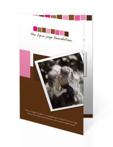
 Personally, I like the Bi-Fold brochure
- It’s exactly the same price at a tri-fold or cheaper because there is less folding. It’s the same sheet of paper.
- It can be mailed in a standard envelope (invitation size).
- It is a larger folded size than the tri-fold so it feels more important.
- It’s easy to layout. There is a cover and an inside…not several small panels.
- It’s not the standard hotel lobby/dental office brochure.
By this simple alternative, your “cheap” brochure stands out from the competition. For my printed marketing, I use a standard bi-fold brochure. It works as a mailer and a leave-behind. It’s just a basic, small brochure. It’s also a step up from a tri-fold brochure.


