Don’t Pay for a Bad Sign

How much does it cost to have a sign built and installed? Could be hundreds. Could be thousands. Don’t spend a dime having anything printed or constructed or installed that isn’t designed by a professional. Oh sure, you could have the sign company “design” it. Maybe you found the one or two sign companies that […]
Sherwin Williams…What the Hell?!

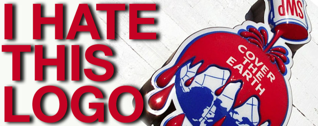
This may be my least favorite logo of all time. Seriously, a giant can of paint is dumped over the entire planet? Do we want to paint our oceans and forests?! This is terrifying! Ok, fine, the logo was designed back in 1905 before they knew stuff like the dangers of lead paint. This isn’t […]
Do Not Remove Your Card…No, Remove Your Card

I make this simple mistake all the time. I’m at the grocery store paying with my debit card using the chip reader. The person helping me asks me if I found everything ok, there is beeping and other noises, another person asks me if I need bags, I look down at a little screen and […]
Stop Putting Twitter Icons Everywhere!
Companies put Twitter icons, Facebook icons, Instagram icons, Google icons, and other icons on their front doors, on their packaging, on broadcast ads, and in their ads…It has to stop! No Shit Your company has a Facebook account? Wow. Impressive. The dumbest, ugliest guy from my high school has one too. Your company is expected to […]
Slam Dunk. Big Deal. How Long did that Take?

When we see an NBA star crush a slam dunk we are amazed. We jump to our feet and cheer. We recognize the dunk as an amazing feat…We don’t point out that it only took a fraction of a second. When people see a simple, elegant design they often remark “how long did that take?” It’s true. I […]
The Chargers Fumble their Rebrand

The San Diego Chargers announced that they are moving the NFL franchise to Los Angeles. They designed a new logo emphasizing the new city. I was interviewed for my opinion on the logo. The first thing I said was that it looked like the Dodger’s logo, and I thought it was cool. I liked the […]
Anatomy of a Website Redesign

[vc_row][vc_column][vc_single_image image=”1951″ img_size=”full” alignment=”center”][/vc_column][/vc_row][vc_row][vc_column][vc_column_text]We’re thrilled to have launched our updated website. This site showcases some of the elements of modern website design. Good web design is built around the user’s experience. Today’s standards are in response to the way people currently interact with the Internet. Visitors to your site will not only be on desktops, but […]
The Miracle of the Honeypot

If you have a website, you should have a contact form. You want visitors to contact you as easily as possible. That bad part that everyone with a website knows, is that you will be flooded with SPAM from SPAMbots along with any actual contact your receive. It’s a total hassle to deal with […]
The SpaghettiOs of Design

Go to any graphic design discussion on the Internet and you will find designers decrying the emergence of crowd-sourcing websites like 99designs or website template sites like Squarespace. Doesn’t the pubic understand the value of what we bring? Don’t they know that a solution needs to fit the client’s particular needs? Why do they think they can […]
Warning: Do not respond to "hearing impaired" prospects!

We are suddenly inundated with requests for quotes from new clients. None of them will talk on the phone. Many of them claim to be hearing impaired. This initially bugged me because I prefer to actually speak to a client and not communicate just by email. I also noticed that several of these “potential clients” […]


